More Token Questions

art-assets

#1

Hello folks,

I’ve been working hard on goblin illustrations for my first set of digital assets following the great advice I received on my last post about token design. However, I thought I would pose a few more questions now that I am further along in my project.

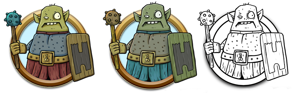
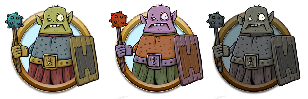
  1. Would you like to see alternate color versions of the same token within in a set? I have shown a possible example of this with the following set of images in the left and middle tokens below. Do you think this would add value or make a set more versatile?

  2. The third token (far right) is a night version of the token, do you think this would be helpful to have in a token set?

  3. Are there any other variations for a single token that you would like to see in a set?

Thanks for taking the time to read through this and for any thoughts you might have here!


Goblin Tokens Now Available!
#2
  1. No.
  2. Ew.
  3. No.

I’d rather see a large range of fun tokens without a bunch of weird variations.


#3

I’m all for color variations,

  1. Yea

  2. Nea but B&W line art is always welcome.

  3. Minor variation of weapon, shield/no shield, helmet/no helmet.

But that is mostly from printing and manually keeping track of HP. Not as big a deal in a VTT system.

Depending on your workflow and difficulty of variants.

10 different Tokens Vs 5 tokens with variable colors helmet/shield/weapon variations…I’d take the 10 tokens.

But if it is 10 unique tokens Vs 7 that have variables…I’d take the 7.


#4

I’ve set an initial goal of 10 unique tokens for the set and could include an additional color variation for each without adding too much more work (if the color variation is popular enough). The example of the color variation I have included in the post is just an example, I would hone in the colors to optimize the look.

With my current skills and process 10 tokens per set is a lot of work so I don’t see myself doing more than 10 per set for the time being. Plus I think 10 seems like a good number to provide folks with enough variation.

Thanks for the feedback!


#5

Honestly, I’d like color and colorless. That way I have the option to color it the way I need.


#6
  1. Yes
  2. No
  3. Yes, pure Lineart.

#7

It’d be fun to have a bloody/injured version.


#8

What @Chaosmeister said… and a bloody or dead version would be nice.

btw… AWESOME WORK!!! … :herocoin:Game On!


#9

Interesting! I’ll have to experiment with that. Great idea!


#10

Ok, so this is what an original plus alternate color with an addition of a line art token would look like. I’ll have to do some more work with the alternate coloration on my other illustrations to see how it will work out, the colors ended up a little weird in this example (it may have been easier just to change the mace to an axe). Perhaps instead of alternate coloration I should do an injured or dead version. More experimenting to come!

@Alex I appreciate the straightforward feedback! One thing I though of was to change the image from a waist up perspective to a shoulders up view. By doing the tokens this way I could probably double the number of tokens in the set because there would be less work to do (so the number count would be something like 20 per set). Here’s an example:

Gob%20Token%20Face%20Only

I like this format because I could get more detailed with personality and facial expression, the trade off could be that you don’t see weapons, armor, or equipment.


#11

Yessir. That’s awesome.

I mean, it’s awesome however you skin it. I love what you’re doing and can’t wait to support you. One thought I did have for color variation is the ring. Sometimes it’s nice to have an Orc Captain with a black or gold band, while the lieutenants are blue, and the minions are red, but the art doesn’t need to be different if that makes sense.

And yeah, sorry to be blunt, but I’ll always stab you in the front with the truth. A “night” token isn’t a necessity in terms of work flow because if I’m doing a dark scene, Roll20 will limit the light but I want players to see the threats when they are revealed.


#12

I will say, the dark one does look zombified or diseased, and that might be fun to explore — a plague variant — versus random alternate color variations.


#13

I appreciate the support! Really good point for changing the ring color, I really like that idea. What I think would be important for the ring coloration would be to stay consistent for all the sets. Ring colors could be something like grunts/minions in red/copper, mid level grey/silver, and big baddies in yellow/gold. I will think on this a bit more and implement something because I think it’s a great idea.

You don’t have to apologize about being blunt, I find it very productive and really appreciate straightforward feedback. So, thanks for that!

Interesting idea for zombified variants, I will keep that in mind moving forward!


#14

Personally, I prefer the waist up approach; I think it gives a better impression of the creature than just a face, plus you can express character through pose and silhouette.

That said, the bust-style illos could be good for npcs, or for more important characters (ex. the goblin mooks in waist-up, goblin captain gets a unique bust portrait). I’m not sure if that fits the scope of what you’re planning though.

Dig the style though, and I understand wanting to show the quirky details of things.


#15

Good points, I agree that the bust-style would be good for npc’s and important characters (including PC’s). I am planning on doing sets just for characters.

I ran a little test to see how the tokens would look with waist up vs face. The issue with waist up is that is shrinks the token so that they are a little less visible. With the face style they are more clear, though I agree the waist up style is more informative about the creature. Here’s a couple screen shots from Roll20 to show the differences:

This is at 100%
22%20PM

This is at 200%
39%20PM

So, there is a lot to think about today and Im starting to get a little AP. I think I will take a breather and then solidify my plans since I am at a critical point. Thanks everyone for the advice so far!


#16

Those screenshots look great!


#17

Nice Shots. Seeing this I would prefer the Bust probably as clear visualization is more important to me. But its a matter of taste.


#18

I have not played online, but looking at your screenshots the face tokens stand out more and are faster to notice and understand. Either way I like 'em! :+1:t3:


#19

Let me just say I think this is awesome. Your art rocks and has made great progress in a short period of time. I love seeing every iteration of your art work.

That said, coming from my own experience, I don’t value color variations at all. It’s a lot of extra work for very little payoff. Some people really dig it, but I prefer to work in black, white, and gray. I offer color variations on my Patreon because some people really value it, but I think grayscale actually will get more use and allows for more creativity. Not that you need grayscale, just saying something more purposeful will always shine through.

That said, the JRPG genre makes use of color swaps to indicate different levels of difficulty, so it might be valuable to people in that way.

There’s no right answer, haha, only what you like doing.


#20

I have my preference to color options. That said, color channels work equally as well if the options are easy.

But what is wanted or your clients are willing to spend on, it up to your clients. Following D&D release schedule is best. But with in 3 months is pretty much good enough as a new setting takes time to digest and put into a campaign. Or you can look at a genre that there is not enough to contain.