Thoughts Needed on Token Design

art-assets

#1

Hello Fellow Lumps,

As some of you may know from my January Art Challenge I have been on a mission to learn Photoshop and create digital assets that can be used for our online games. I am moving toward producing assets for purchase at some point this year but I have a number of things to work out first. I need help deciding what token format to use for characters and creatures and thought I would ask you good folks since some of you are running games via Roll20, etc…

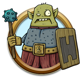
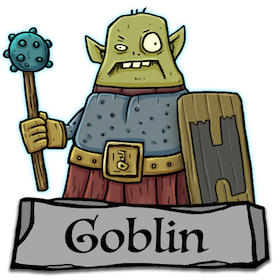
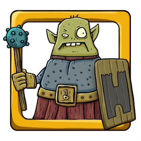
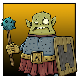
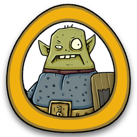
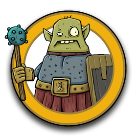
The most common format seems to be using a circular disc with a colored outer ring. Where I do like this format I would like to do something a bit different or perhaps offer a disc as well as an alternate design when I offer them for sale. I am curious about your thoughts on this or if you have any opinions on token designs you like or may want to see. I have produced some mockups using one of my recent illustrations to give you an idea of some potential options:

Key%20Guard%20Goblin%20LR
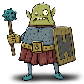
Front View / No Token

Goblin%20Token%20Test%201
Waist Up / Titled Base

Goblin%20Token%20Test%202
Square Border / Overlap

Goblin%20Token%20test%203
Square / Background

Goblin%20Token%20Test%206
Triangular / Odd Shaped
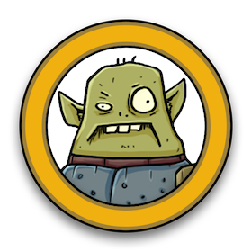
Goblin%20Token%20Test%205
Round / Inside

Goblin%20Token%20Test%204
Round / Overlap

Goblin%20Token%20Test%207
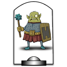
Stand / Tabletop Feel

Any thoughts or options about what would work best would be greatly appreciated! Thank you for taking the time to look through these!


More Token Questions
#2

I prefer round, but with even more overlap — as in, maybe include the shield too. My second pick is square with overlap. Again, I think I’d like to see more of the token overlapping. Maybe even the head.


#3

I agree. I like the Round / Overlap myself.

Consider most people mix different token arts together and probably want them to all be round for consistency.


#4

I’m feeling the round with overlap as well.

Maybe with with a little thinner boarder and defiantly a little more overlap from the mini.


#5

Round or square with overlap as well as Round/ Inside. I suggest looking at the marketplace for Roll20 or Fantasy Grounds.

If you like to do a full front view you might consider doing print and play paper tokens as well.


#6

I like the round and round/overlap. Likely because it’s the Icrpg token style I’m used to seeing. They all look pretty rad though man.


#7

Is it wrong to say I like them all!?!

But I agree with @Alex, round or square with a lot of overlap.

Good work … Game On!


#8

If only VTT.
Round and Square With moderate to heavy overlap.

I would consider Rounds and stands for cutout printing though.

Though I personally love the triangular.

It’s an odd thing with digital assets…you can have choices after your initial sales and spend more time on options for those that sell well.


#9

Those are brilliant. Love the style.
I would go for the oddly shaped triangular oval with lots of overlap.
Fits the art style :green_heart::beer:


#10

I want to expand on my point of digital asset selling.

On Drive-through RPG. You can revisit established items and add additions or corrections as needed. @Runehammer has made a total return customer out of me, by doing revisions as needed to ICRPG.

While I’m not clear on addition pricing…I also don’t think it is the rout to go.

So let’s say you have 12 collections on Drive Through RPG. You release them all at the same time.

Cartoony dungeon denizens Vol. 1 is by far your best seller.

However, you Later make Cartoony Dungeon Denizens Vol 13 and you changed some basic style types, introduced triangular oval, and alternative colors, and alternative backgrounds…you drastically improved your workflow since the prior batch collection. As well as your notoriety.

And in 6 months it outsells all prior collections combined.

You can still go back and upgrade Vol. 1 to your current standard…call it Vol 1 revisited…(so it’s a semi-new release, and update your early supporters for free so they still think you are cool…and revitalize the sales of that work from 2 years ago.

In essence don’t be afraid to experiment and make mistakes. As long as you still have the originals you can fix it later.


#11

Wow! thanks for all the great feedback here, it is immensely helpful! It looks like going with a round token with more overlap is the way to go. I will get busy on making a few more mockups so I can nail it down and will post them as soon as I can here to see what you guys think.

Thank you @Paxx for that insight on selling assets via DtRPG, I need to spend a little more time researching assets there as I have only looked through the assets on Roll20. I have considered selling through my own website (if and when I set it one up). It’s good to know that I have the option to upgrade the assets as I improve and will certainly keep copies of all my work, thanks for the encouragement there.


#12

Yup, I’d also go with round/overlap. :+1:t3:


#13

I love round with overlap for digital assets. But, maybe include no border for those of us who want to print the digital ones. :slight_smile:


#14

Interesting, I’m curious about the printing process. Are you printing out the images and putting them onto actual discs? Or, are you printing these on cards? Just wondering how the no-border is a help. Would a simple black line suffice?


#15

Square no border so we can just cut them in mass squares. Or use circle cutters.

https://www.amazon.com/dp/B07VWWB5M1/ref=cm_sw_r_cp_api_i_8-AwEb7BZ0MPD

Im not recommending these!!! Just first example I saw had 1” and 2”.


#16

Ok, cool. Perhaps having the image contained within a shape (no overlap over a border) and including enough background bleed for the punches would work best. This harkens back to my time designing board games where I needed to make punchable tokens (in this case it was circular punch outs that were adhered to hex tiles). I will keep this in mind for the future as an add on or upgrade to a current set.


#17

Goblin%20Token%20Test%208

I spent some time this afternoon learning some technical stuff in PS to make the framing ring of the tokens. There is going to be a lot to fiddle with here but I think I am on the right track. I wanted to bust out a round token with overlap to get the basic idea since that seemed the best choice based on your feedback. Now it’s just a matter of working through it to find the best match for the ring design for the illustration style. I know for sure that I want to add a black stroke around the outside to make it pop.


#18

This is really good. Great work on taking eveyones feedback and making it better… now we only need a thousand more for everyone characters and monsters! :laughing:

Game On!


#19

Great work. I too like the overlap but also the stand/tabletop one incase people want to print it out for an irl game


#20

Yeah totally agree with @orkcol … would love the VTT token and standee for the IRL games on the tabletop.