A Question About DriveThruRPg Printing Quality


#1

Hey Everybody,

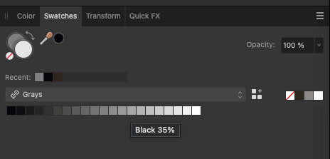
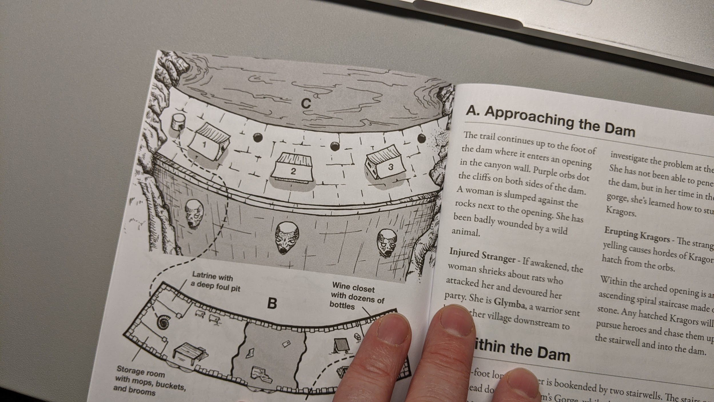
I have a question for those of you with experience with publications using DriveThruRPG. I am working on a book that will be printed in black and white and I am doing my own illustrations for it with black line work and a single tone of grey (35%). Do any of you know if the printing process that DTRPG uses prints greyscale darker then the original image? I am concerned that the grey I am using may print out way too dark even though it looks great as an art file. I think they use inkjet for their printing and I am concerned it may print on the saturated side. I have contacted them but it takes forever so I thought I would ask here.

I have over 100 illustration to do and have only finished about 10. So, if I need to make a correction it should be now instead of later, it would be a ridiculous amount of work to adjust after they are all finished.

I appreciate any insight you may have on this!


#2

I don’t know yet, but I will soon. I’m about to have my first print title up by the end of the month (fingers crossed). I can report back after I upload and get a proof in hand.

What do you mean by grey 35%?


#3

Congrats on getting your game finished and into the final stage! That is a huge accomplishment and super exciting! I would certainly appreciate any feedback you have once you get that proof. I also look forward to picking up a copy once it is out!

I am using Affinity Photo to do the illustrations. The line work is all in black but the shading is done in a tone of black. There is a palette selection that is only in grey tones of percentage of black. So in my case I chose 35% black for the shading. However, I have since dropped that down to 30%.

35%25%20Grey%20Example


#4

Thanks, man! Hold the congrats till later, hehe. Still a chunk of work to finish before sending it to print. :blush:
My project is in color so I’m not up to snuff on black and white for print. I’m dealing with cymk profiles, which is a bit tedious to make sure I don’t oversaturate ink levels. I’m working in Affinity too, publisher and photo.
Have you checked their print specs to make sure your document is in compliance?


#5

Well, just getting to the point where you are considering print options is certainly an accomplishment.

I have gone through DriveThru’s print specs and am using their Affinity Publisher template. The specs for the illustrations is fairly straightforward for black and white images. I do have this nervous feeling though that something has been missed. I guess I should re-check again…

This does get me thinking that maybe I should look into color if nothing else for the premium paper. Perhaps I can do something with mostly black and white and minimal color. Hmm.


#6

I published a black and white physical book with a lot of artwork and I found the dynamic range of the greys to be pretty good. The grey in the images below is about 30% (70% lightness) They will send you a proof before you publish, but it does take a while for those to come in and adjusting 100 images doesn’t sound fun!


#7

Oh man, thank you so much for the info here, I really appreciate the photo too! This is good to know since I dropped the grey to 30% and also added another 60% grey for detail work (I found this really helps with the look of the images). The grey in the photo looks really good!

Yes, adjusting 100+ images would be a serious slog.

Thanks again!