Ye OLD Community Monster Manual


#1

Hey folks, a while back we put together the community monster manual (https://drive.google.com/file/d/1DnbGycT0oOmQLQzvILN6fO-oebskqL4X/view?usp=sharing) 16 pages of fan created monsters.

Recently tabletop simulator has added PDF support in game so I am blowing the dust off this pdf and giving it a facelift. Before I get to heavily involved in redoing it, i would like your input on the look of it. I seem to recall (and i am not a graphic designer) that hank mention the fonts should be the same and not to use auto sizing font.

So here is the newer version of the form fillable pdf.

https://drive.google.com/open?id=1tqdqUwu4w6IdKz0ltfKXtMn3_ziiAL2e

I have changed the style slighty to put a header above the actions and then action text below. The end result will look like this…

Looking for input or thoughts before i start converting previous monsters into the new format.


#2

I need to start by thanking you for all you do…really. Thank you, hours of entertainment. And this is a labor of love…but you asked for input and thoughts. Also remember if you ask next week, I’ll probably say the opposite since I ate a steak then and Taco bell today.

Clarifying:
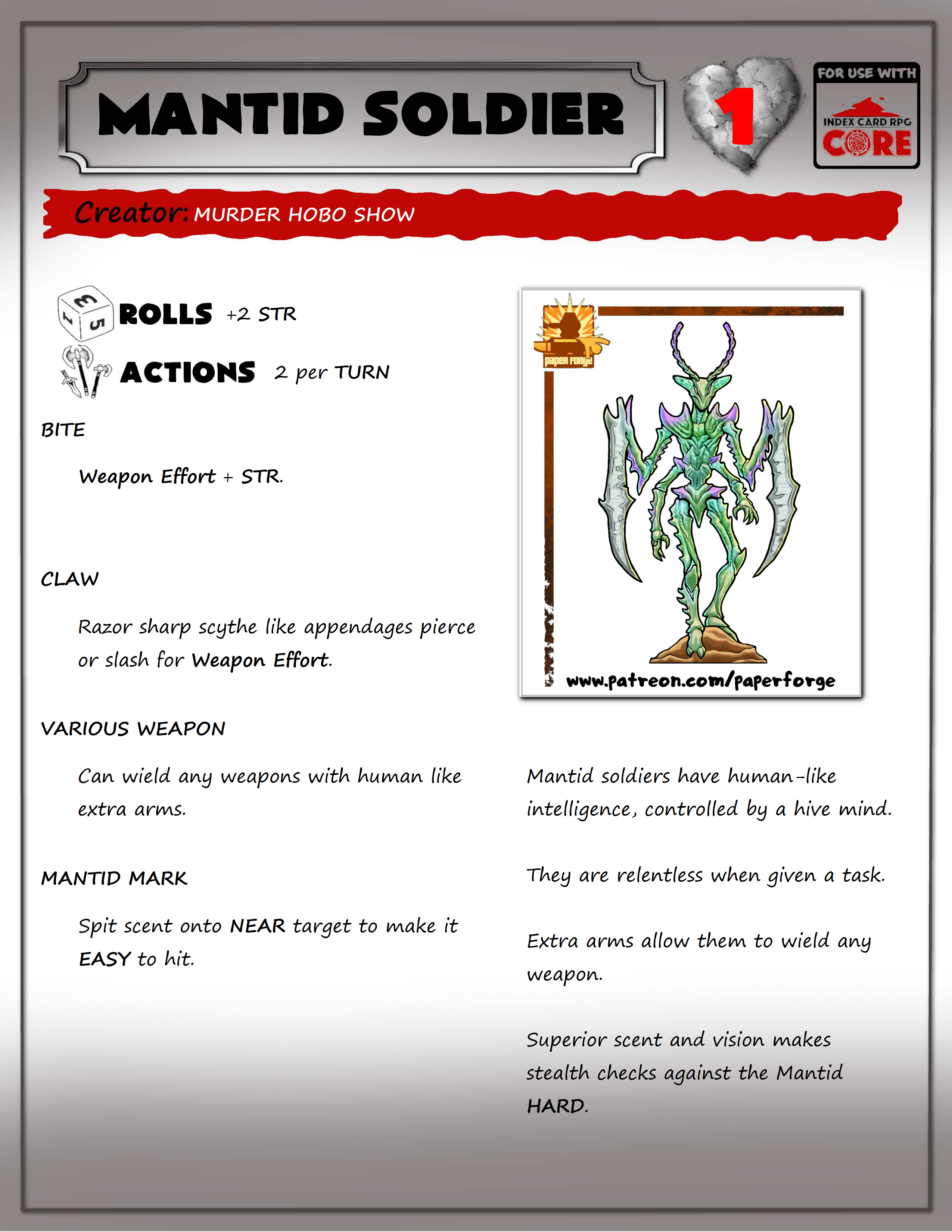
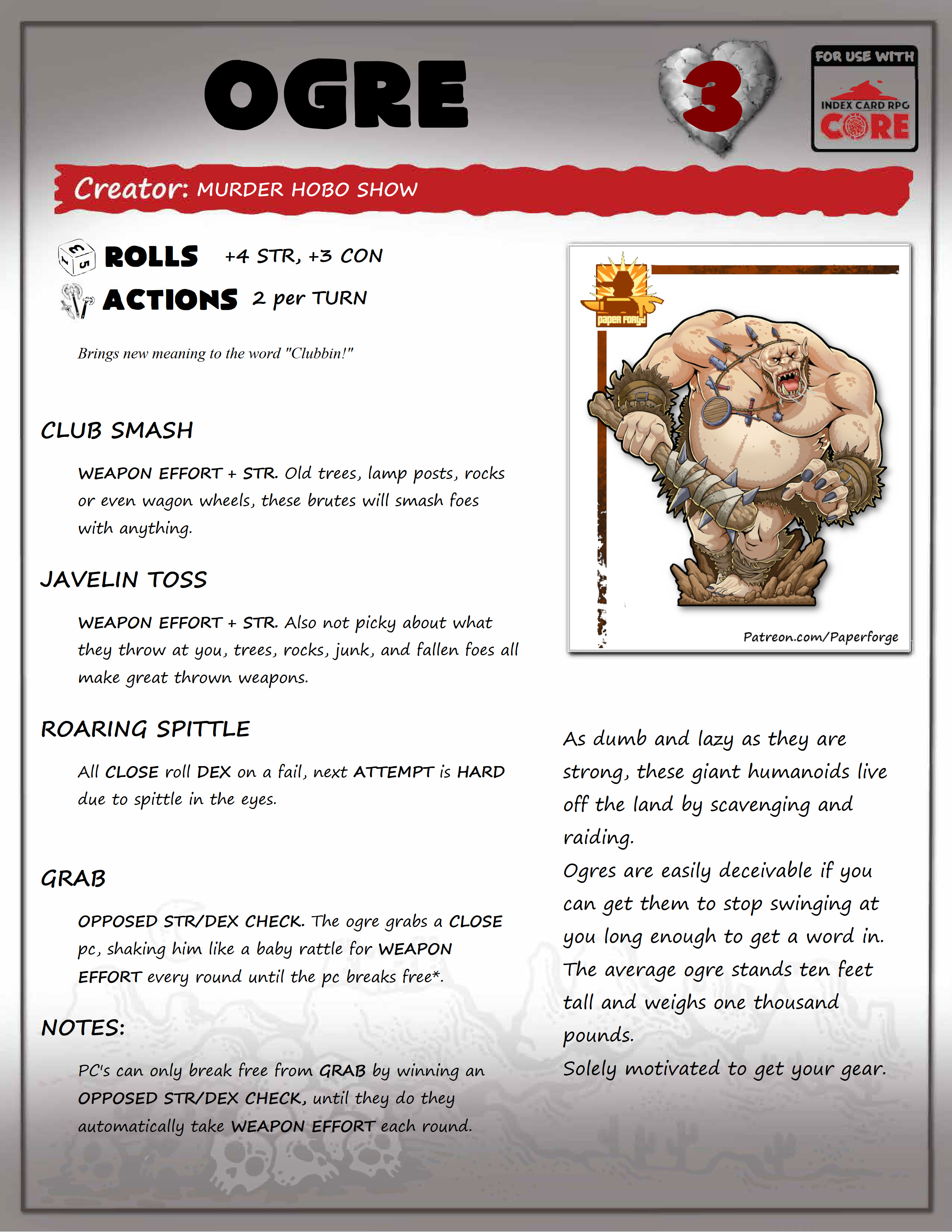
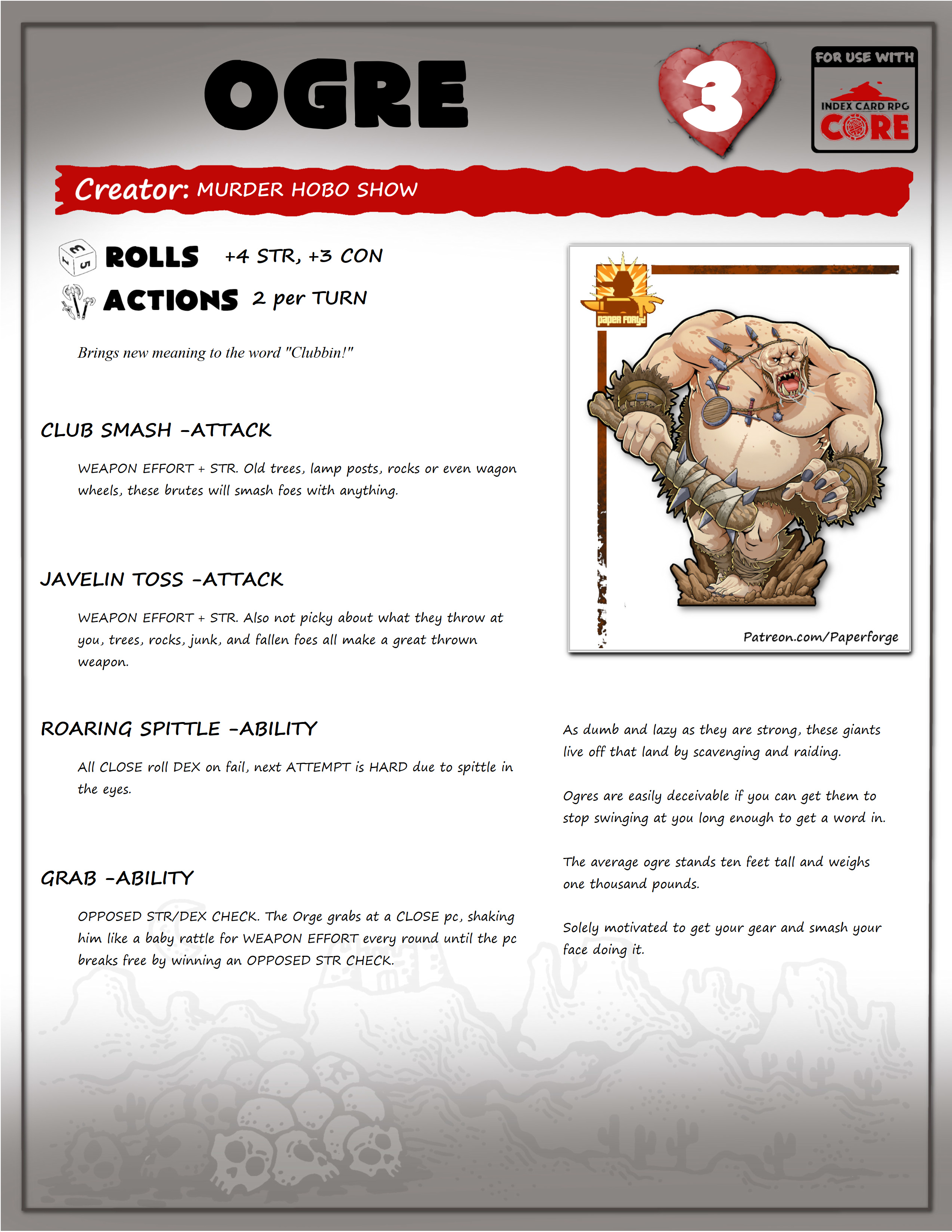
we are critiquing Layout, not creature…cause I have my take on 2 attack type targets with almost identical attacks :stuck_out_tongue:

Personally, for this type of thing, I like font that is more plain. New is better than old in this regard.

New format makes it much easier to read. We need to see an example with a lot more text…Variable sized fonts can be painful. Damthida pg 7 of the PDF is interesting to read at 75%

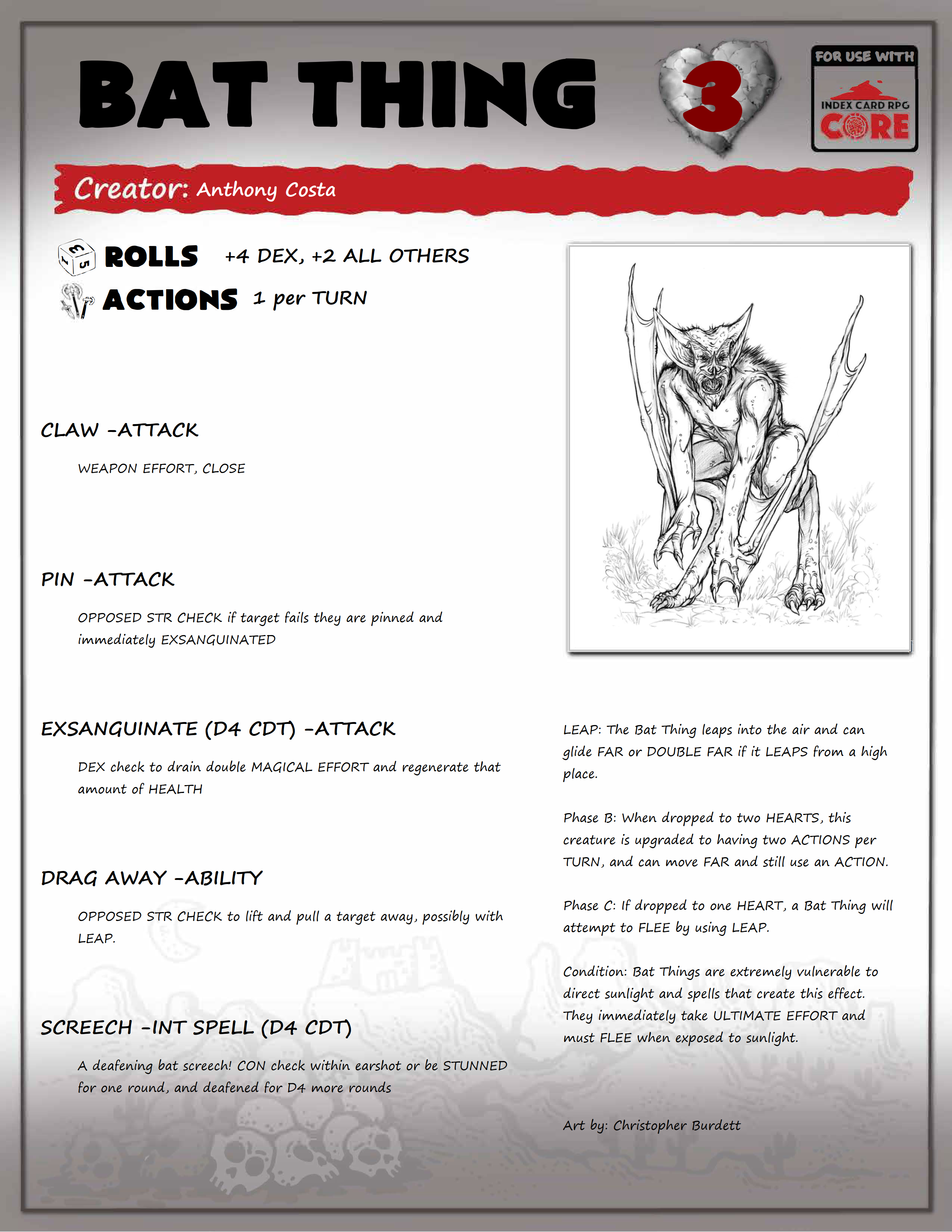
No distinction from attack types to behavior write-up. In most of the old layouts this is the same, but in a few, they explain further attacks, special powers, a bit of history…kind of all over the place. This is not a template exactly.

The Axebane Games background I did like on the bottom of the PDF pages…if a permission thing, totally understandable.

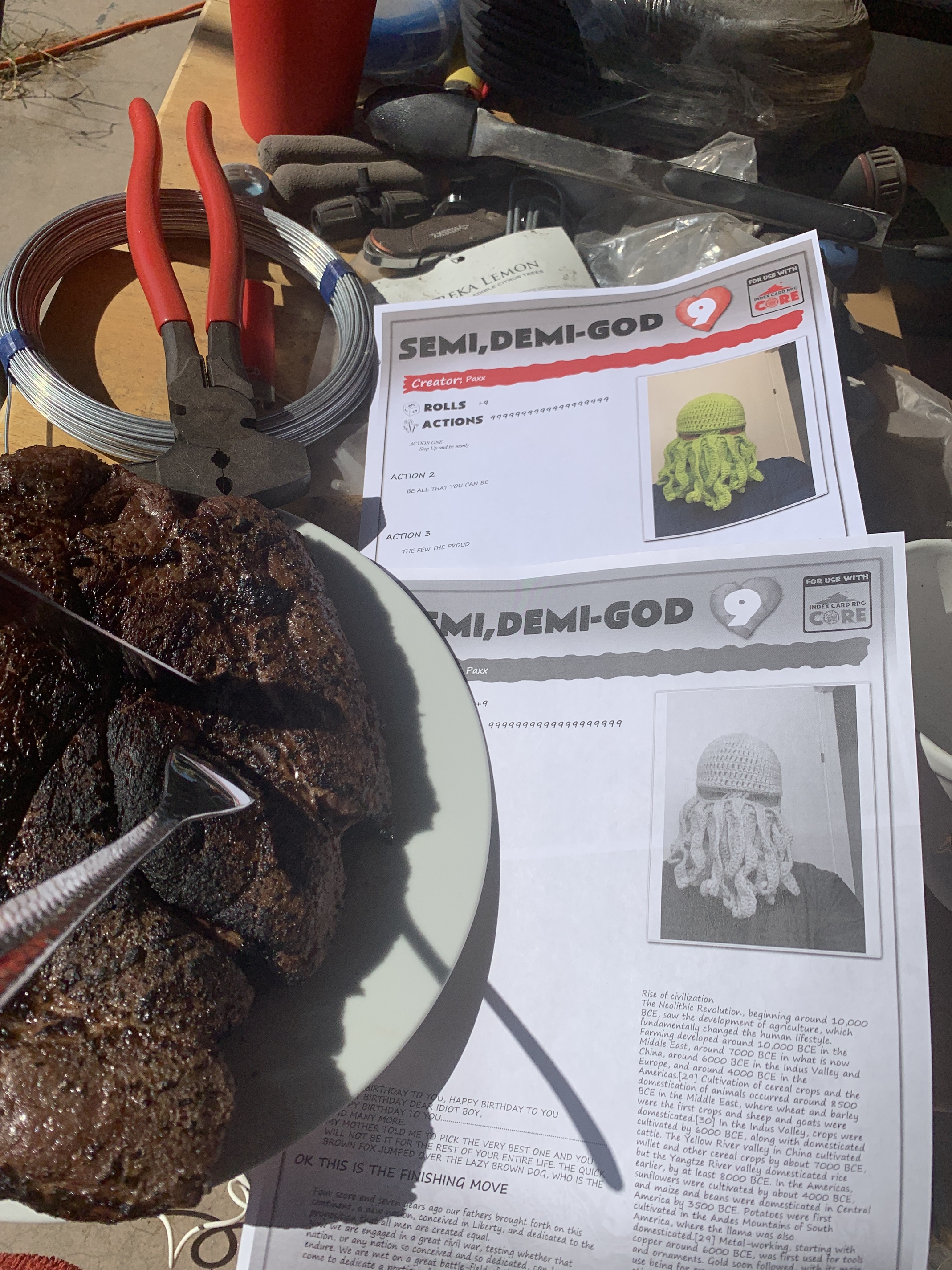
I’m not sure the intention of moving the “For Use with Index Card RPG Core” Not sure that the new place is better. Pro for new place, it is seen faster, Con is it makes the top busy with information not relevant to the user except a person seeing it for the first time or first impression.

Issue in both designs. When printed on a B&W printer, “Creator:” merges with the red banner the Heart and number do not have enough contrast…number needs an outline, and the heart probably can also use a larger or more pronounced shadow, so the top does not fade into the gradient.

Border surrounding Name of creature detracts…not sure of a good solution, perhaps deepening/lengthening the gradient and making text white??? no idea, just detracts.


#3

Sorry its been awhile since Ive been back… works killing me and i was on vacation camping. Thanks for the reply PAXX!

Im going to remove the border. Agreed it doesnt need to be there.

Curious as to a font you would prefer to read in?

ICRPG CORE moved to create more space for a text box useable as a history or background info on the creature that doesnt go into attack type box.

I didnt put in the attack type in front because i think its pretty obvious via the description what the attack calls for and what roll should be made. I would consider putting this back in.

I will work on trying to print black and white.

thanks man :slight_smile:


#4

Ok, I made a few changes to the format again. Hopefully this one turns out better.

Lemme know what you think.

You will notice the text box on the bottom right is bigger… this has been fixed.


#5

Ok, Lets get at it…Thanks for helping me procrastinate at cleaning the house :stuck_out_tongue:

Bottom texture is back :+1:
Border around name is gone :+1:
Font in Red Sash, is now white and high contrast when printed in monochrome/grey scale/B&W :+1:
I like it and we are probably beyond my capabilities to notice improvements???

As to my preferred fonts…I am so boring and forgot the names of fonts (20 years ago I could have told you straight up, different jobs, different things in the brain. Also the bastards changed the names to not pay royalties.

Going down the list in Word. probably in this order as far as ease of reading yet liking style.
OCRB
qtquickcontrols
HP Simplified
Miriam
Sans Serif (A.K.A. Microsoft Sans Serif in my computer.)
Georgia

Ease of reading by font size computer:
OCRB
Sans Serif

Most concentrated font of this list (takes up least physical space) :
HP Simplified
Miriam

I like best in most cases:
OCRB
Georgia

Best for Sci-fi or Noir:
OCRB

For this application??? this is so subjective I have no idea.


#6

very nice, ok for this application these fonts are ok though? not hard to read or to much?

Heres BAT THING redone… i have taken out BOLD and just stuck to capitalizing ICRPG terms. wondering if people like BOLD CAPS or REG CAPS to catch your eye.

Shrunk the text down one FONT size to make more room.

I put the art back as i will credit the artist on the front cover instead of every single page.

Thanks again PAXX.


#7

All good, we are in the subjective realm on many things and my critical skills on layout are maxed out. With the smaller text, this creatures page seems empty…

would love more contrast on the number in the heart.

Ideas, not even recommendations, just trowing things at the wall.

bigger picture to keep text uniform but not be as empty.

Adjust Font size per creature…(I don’t like that at all…but it’s an option).

All Caps keeps with the ICRPG style better.


#8

I’m liking the improvements you’ve made. What bothers my eye is the For Use With and the Heart. They compete for my eyes attention. For Use would do better placed at the bottom out of the way.


#9

Thanks Shady, the reason its not at the bottom of the page is because it gives me more space for a bigger text box.

I’m trying to create a “generic template” that i can just pump monster info into and then combine it into a manual.

Heres the problems…

i dont want to do “layout” for each creature.
font size needs to be the same across the board. a bigger size means less text space and smaller sizes mean a more empty looking page. - there seems to be no good in between so im going with smaller text for more info.

For use with is at the top, because with a form fillable pdf with alot of monster text it will have letters written overtop of it at the bottom of the page. OR the background info box needs to uniformly shorter. I will link to the form fillable PDF in this post so you can try and enter your own information.

https://drive.google.com/open?id=1VSB4oOhd1LvkVMEY38VvXgqQ7VlvaMUA

link to the form fillable empty PDF


#10

Im hoping the red shaded heart will provide enough contrast with white numbers for hearts and now be more distinct from the “for use with” logo as well… PAXX thoughts?

I’m thinking this is the one. smaller text red heart.


#11

Looking…
I’ll play with it a bit while I eat. It’s a stupid big steak, so it might be a while.


#12

Can you make it s bit smaller, incorporate it into the bottom right corner of the art box?


#13

Sure can do. Not sure if I can make the image smaller, that might be a runnerhammer thing.

In sure someone will know


#14

I like it!!! Text boxes are not perfectly aligned but still good.


Looks good in color and monochrome.

If the creator sash/background color could get ragged at the end or start to fade on the right, that might be cool.

“For use with” is not as distracting with a white heart number.

Text is all large enough to be read.

Could not fit SEMI-MINI-DEMI GOD as the name of the creature.


#15

could you repeat that… i cant stop staring at that steak… nice.


#16

Hows this looking for you… i just moved it to the bottom, if it perchance gets written over… so be it.

moved the heart a little more right as well.

heres a link to the PDF to test it out.

https://drive.google.com/open?id=1ZiAikUEHXbFZxUsTMgJu1ey06oqGdHrd

lemme know what you think… and ill start pumping out the monsters.


#17

with faded to invise banner as well… not sure i like this one.


#18

It’s on the page as it should be, but doesn’t interfere with the content. I like. :+1:t3:


#19

On screen, it is better solid…Printed that huge empty red Sash is bizarre. In B&W its good…So in 2 out of 3 Solid is better.

Like I said, end of my expertise and throwing ideas at the wall.


#20

Ok cool thanks for your input. Red banner will stay solid, icrpg logo bottom corner a check.

I’ll fix it up tomorrow sometime!

Thanks gents.