
I didn’t have the time to explore it yet, but the overall feel is good. I’ll let you know if i find something ennoying. ^^
REPORT BUGS HERE
owensd
#23
Thanks for all the hard work here. I have to say, I liked the old style better.
Things missing that I preferred from before:
- The avatars of those that have commented on the thread as opposed to just the one that created it (homepage).
- The white seems a bit overkill and especially bright; I think it’s the contrast that is so glaring to me
- The tab bar looks a little squished and a bit odd next to the banner graphic.
- The reddish-flash that fades is a bit weird. I get the idea, but I’m not sure it’s really necessary, especially when I’m clicking on a card that I’ve already read.
- In the threads, there seems to be too much padding between the text and the heart/…/reply bar
Nickster
#24
Good feedback!! Thank you. Yep, still working out the design, finding a happy middle ground between too dark and too bright. We can roll back to the previous design at any time.
Can you please post a screenshot of the padding issue you’re seeing, and also the browser you’re using. Thanks!
Nickster
#26
Excellent, thank you.
And if you have any thoughts or advice on color palettes let me know.
Nickster
#28
Both of these are to be fixed, the bar is one of several padding issues, and the flash you are referencing appears on the first post as you enter a thread, correct?
Nickster
#29
By the way, Discourse has an option for setting themes on a per user basis. Maybe that’s an idea down the road.
owensd
#30
Theme choice could be good… but also ruins the identity of the site. Probably should talk to @Runehammer about which he prefers.
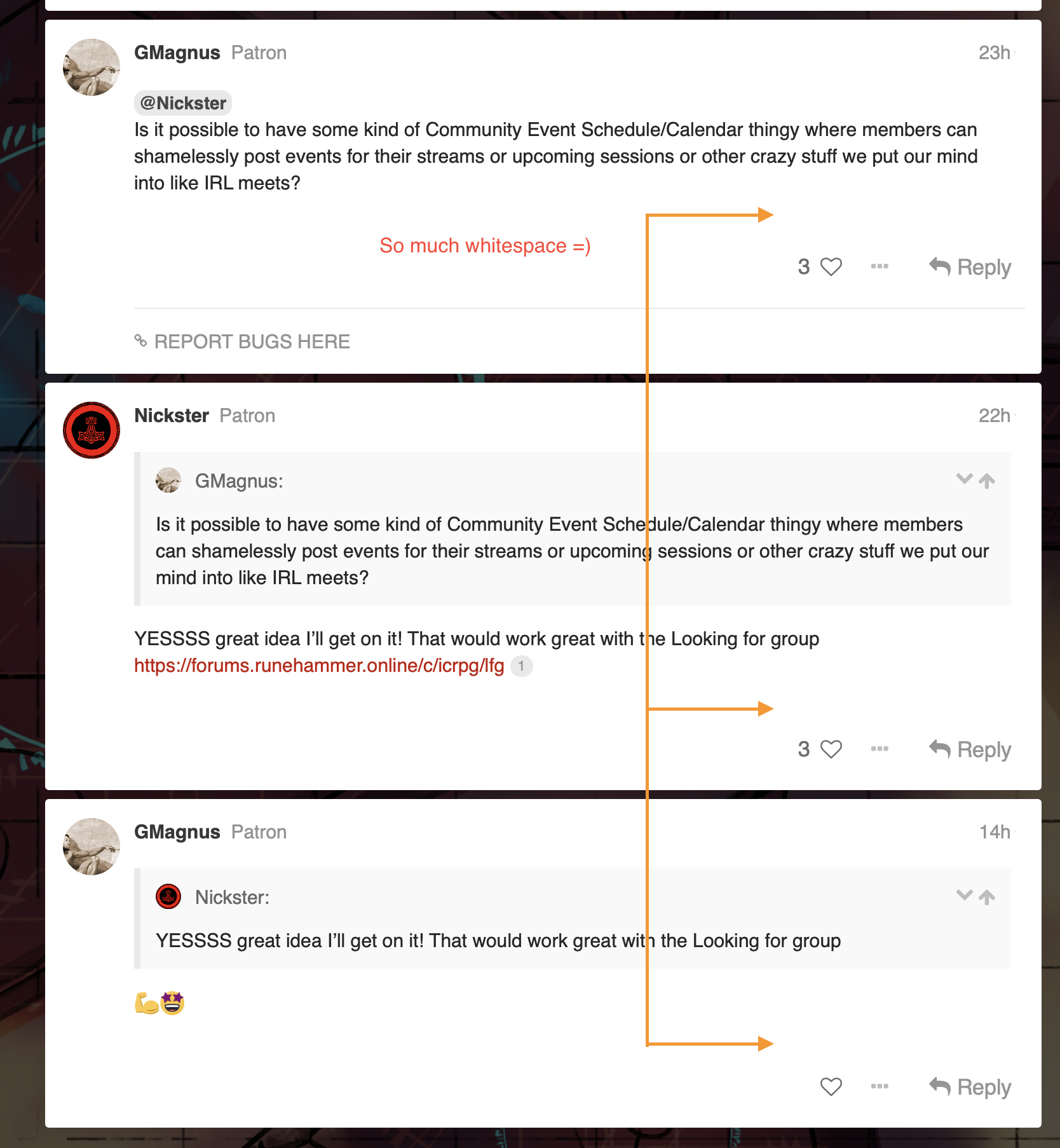
Here’s an example of the whitespace I’m talking about. It adds up to a lot of vertical space, especially for smaller posts.
@Alex this can’t be the G+ contrast ratio as the background there is much lighter:
Anyhow, like I mentioned before: great work on all of this. It’s just refinements and nitpicks at this point.
The flash is the appears on the first post, yeah. It’s got a fairly unflattering color, fades slowly, and in my opinion, doesn’t really add much. If you miss it, you have no context for it. If you don’t miss it, you’re probably trying to read the post and it’s a bit annoying to read something with an animating background.
Nickster
#31
@owensd fixed the padding, please check it and let me know what you think
Lightened the background a bit, let me know what you think. The flash I’m looking into. Might be a way to change how that works, so it’s not a background indication but instead perhaps a border or an element that flashes or fades.

Stashhound
#38
When filling out the about me profile section, everything I typed was duplicated in a box below. If this is not a bug. Maybe you can help me understand why this is set up this way. Thank you.
Nickster
#39
That is a live preview of how your information will appear on your profile. If you use any bolding or italics or add links or images, you’ll see how they appear in that box.
skb
#40
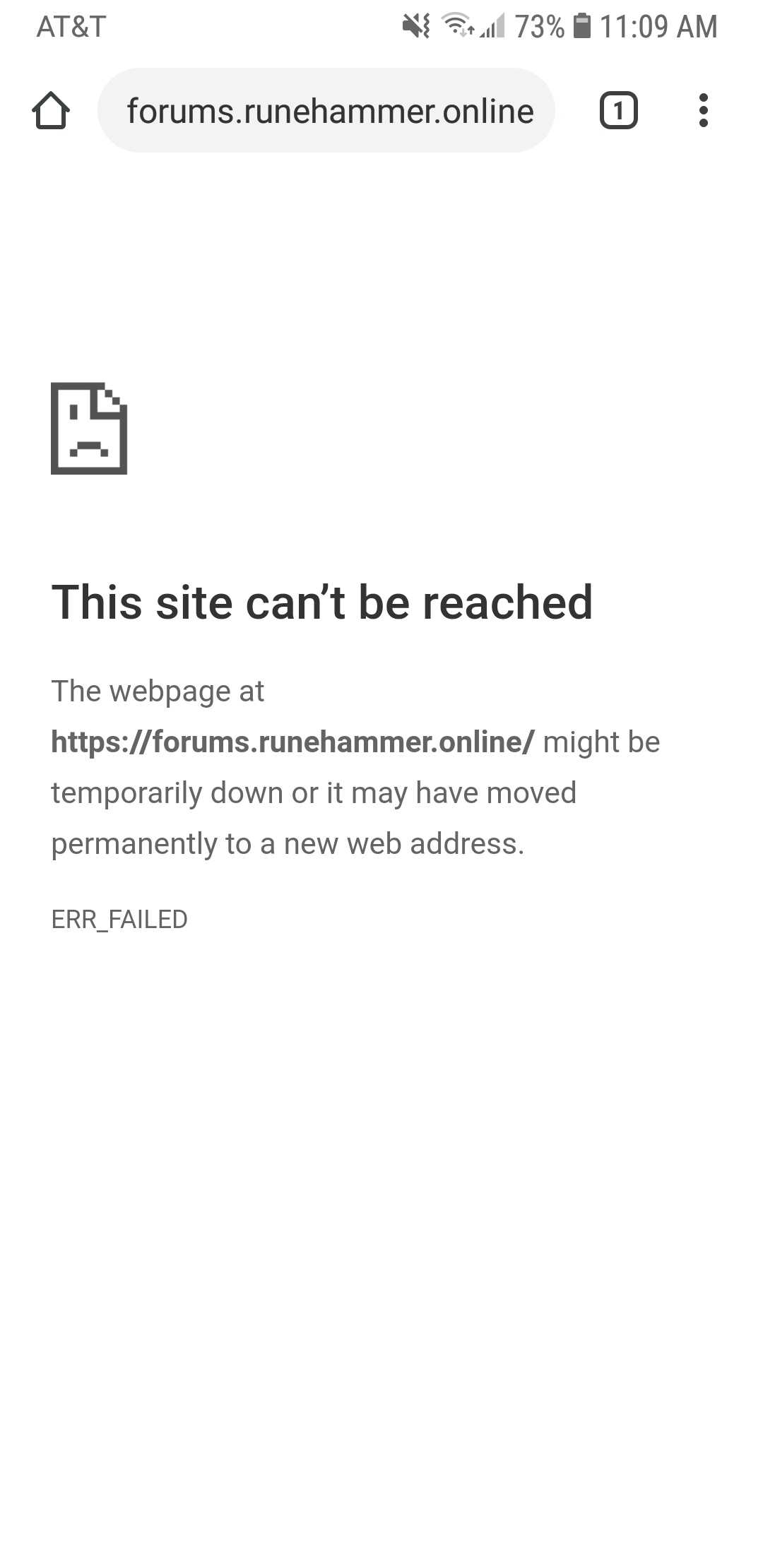
The signup page links to a missing upload –
https://forums.runehammer.online/uploads/default/original/1X/fe0fb34e33d747e430c819b073cb26a6f09553d0.jpeg

Edit: That image is also showing up in the header rotation.