
Hello there Shield Wall!
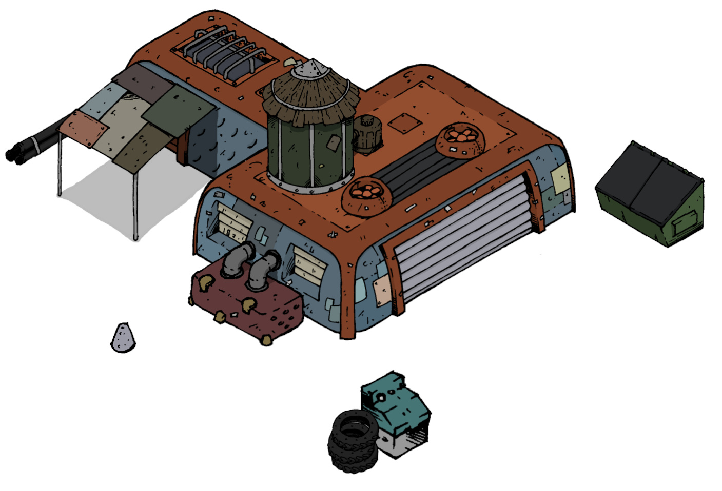
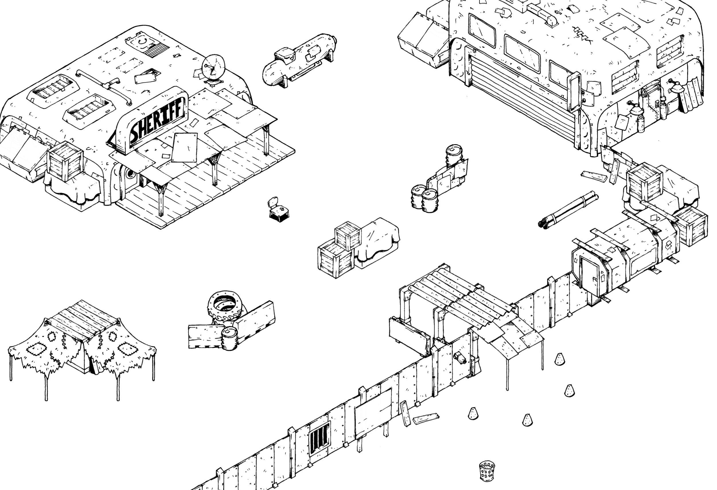
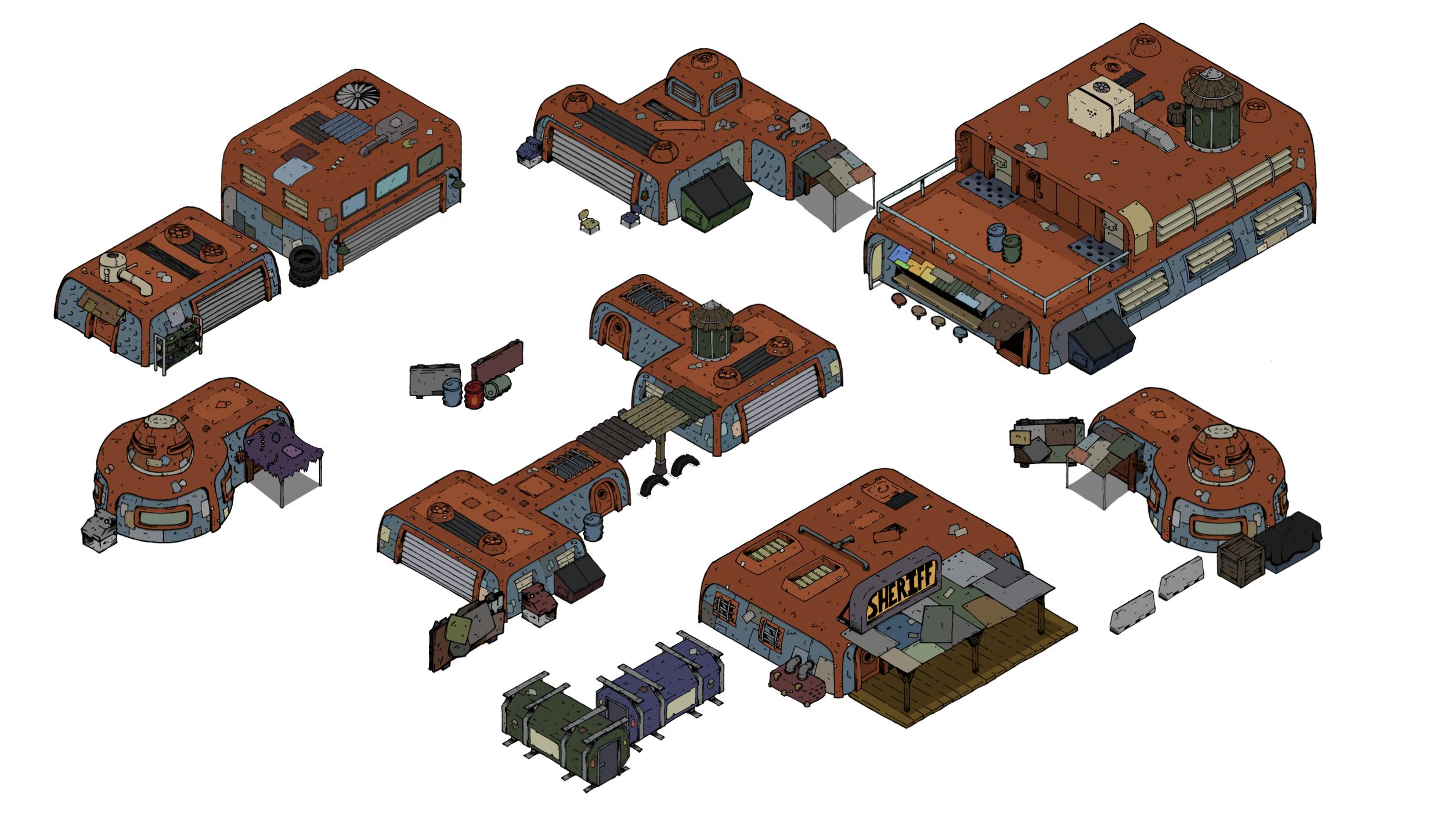
I’m in some dire need of input and perspective. Currently, I’m drawing up a bunch of isometric post-apocalyptic images to make modular battle maps. So far, I’m having a blast doing it, which is nice, but with the work involved in assembling a map (even a demo) I feel like it’s going to be too much work for the hobby gaming community.
So here’s the question: when developing tabletop assets is it better to have deeply customizable assets, or something quick to drop in for ease of use. Our community loves to tinker around with stuff, but it’s also asking a lot.
I feel like I already know the answer: keep it simple, this modularity is unnecessary. I’m hoping you all that have been doing this longer than I have can shed some light on the logistics of this kind of undertaking. I’m a little defeated sinking this much time in to second guess myself so hard. Thanks a bunch in advance.
Here are a couple images to help me illustrate the situation.
Modular battle maps: too much?


Direct Answer: Easy To Drop, but with some depth.
For my use I tend to just collect a bunch of different sizes in a style I like. For example everything you have now is great!
I wouldn’t expand too much more past what you have, except maybe two things:
- some additional signs such as your “Sheriff” one.
- One thing that I think would be worth the effort (although not familar with the process) is to offer different color schemes/tones. A quick way to denote suttle differences.
I think any less greebles/variety and I would be wanting more.
Out of curiosity how much farther have you taken this?
I have roughly 100 images. A handful of signs, crates, vending machine, lots of barriers for cover like scrap metal and concrete, low walls. But I’m looking to do much more with environmental work and modular buildings as well. However, I’m starting to get hung up on the complexity and what I’d be asking people to do in order to make good use of the assets.
Speaking on behalf of a GM who is absolutely useless with modding or creating his own art assets to use in a Game I appreciate ANY and all depth I can get my greedy little hands on.
Ive been drawing up á truckstop dinner as á starting point fór when the apocalypse takes off then í was thinking about án encounter on á blocked freeway over pass, also án encampent on á bluff.
Isometric maps look amazing. But. What I have found is that assembling a custom map is way too fiddly and time consuming. As a busy DM, when I am trying to throw a VTT map together, I’d rather just slap down some killer looking top down images and press.
If you were to release a 2D top down post-apocalyptic and sci-fi set, I’d gladly buy everything you have.
Modularity is great! However I tend to agree with @Alex. 2D trumps everything in ease of use and customization. 3D or isometric generally looks better but the added depth usually makes assembling a map harder and isn’t worth it most of the time.
I wouldn’t let this discourage you though. Maybe you can come up with a design that can be easily assembled. In that case you’ll have best of both worlds.
That’s a really thoughtful response from @Khan, which is highly usual. To his response, I would add: your art is amazing, and those assets look super dope. So, I don’t want to discourage you either. My feedback is honest, though. So, if you can find a middle ground, I’ll still shell out my ducats.
This stuff is sick man, I love it. It looks like these would be pretty easy to work with, but I’m a designer myself, so maybe I’m atypical in my opinion on that.
Diggin’ this stuff  I like the style and I definitely need more sci-fi apoc stuff.
Because I desire ALL options and possibilities, I say more!
Keep us posted.
Thanks a bunch for that feedback! I appreciate the perspective and the encouragement. Back to the grind, we’ll see what comes out. 
Also, if you’d like to follow what I’m working on, give feedback and ideas, I’m active on Instagram:
daydreamsandtinkering
Update:
Here’s a quick demo I put together for some testing. It had mixed results in the end, but I learned a ton from a couple testers:
- Layering works exactly the same as top-down, but it still created some conceptual issues to get around. It’s not a big factor, but it’s definitely a usability concern when assembling the assets.
- People love isometric art in video games, but there are a lot of tricks going on there to allow you to move “behind” obstacles and not get lost. When people tried to show they were hiding behind buildings it created confusion for others at the table and consistency issues. That was the largest usability issue; it can be hard to read for some.
- People just like more literalism in their maps. People don’t like to abstract about using obstacles for cover, they want to see that they have it. They don’t want to let the narrative to inform the spacing, they want the spacing to inform the narrative, and who wouldn’t? That’s why tactical movement is so important. I don’t mind heady abstractions, but I’m in the minority, and when people show up to the table to roll dice they want every edge and immediate accessibility they can get. Truth be told, when I had to set up a map super quick for last Saturday’s game, I made a greyscale top-down drawing for ease of creation and readability. That kind of told me everything I needed to know.
It’s still a fun personal project, but I’m going to take a little time away from it. I’m still working on map assets, but I’ve got a cool top-down project I’m doing a little collaboration on. More on that in the future.
Well, your points illustrate the most common issues people are having with isometric maps.
Taking some time off can sometimes be valuable to get a new perspective and new creative energy to attack the problem from a different angle.
@Chaologic I really appreciate your introspection. I think it’s great that you take time to self-assess, which can be really hard when it comes to “your baby.” Your work is awesome, and it will only get better as a result of your willingness to gather data and take a hard look. I hope the community supports you a ton because your approach is on-point.
I’ve just been doing some research into the Isometric style also.
Have you seen the EPIC isometric work on DriveThru, create by Alex Drummond?
Pretty amazing.
The guy is posting a lot of cool stuff on his Discord channel also.
I’m seeing the concerns above with it being fiddly to depth sort - for ease of use.
I think you can design around it to an extent, but it’s going to limit it’s customisation.
Do you run your own games?
Yes. Hank bought it back when it came out and showed it to us. He found it difficult to use (for the reasons above) and quickly gave up on it. To my knowledge, he has never used it for a game. I saw enough to realize it would never work for me for VTT play. There’s a reason a ton of us use Two-Minute-Tabletop assets for creating rooms that can bring our vision for a space to life quickly and easily.
I haven’t done a ton of market research yet, so thanks for pointing me to that isometric bundle!
The level of detail is what really drew me in to the isometric style, but I find it just isn’t functional for the ways most people play, even me. There’s only so much abstraction I want to bring to the tabletop in the battle map area.
I do run my own games! My group is playing an action horror game inspired by the likes of Bloodborne and Castlevania we’re calling “The Hunt.” It’s a real departure for me, and we’re really enjoying the depth of play. We’ve modified elements of ICRPG to test ideas quite a bit, so now we’re finding what we really like for when the global story wraps up a few months from now.