
Hey there shield wall, this is my first character art commission.
I’m a bit nervous about the finished product because I’ve never done anything like this before. Comments and constructive criticism are welcome, and is the level of work you’d expect from a character commission? Anything missing from the norm? Thanks a bunch!!
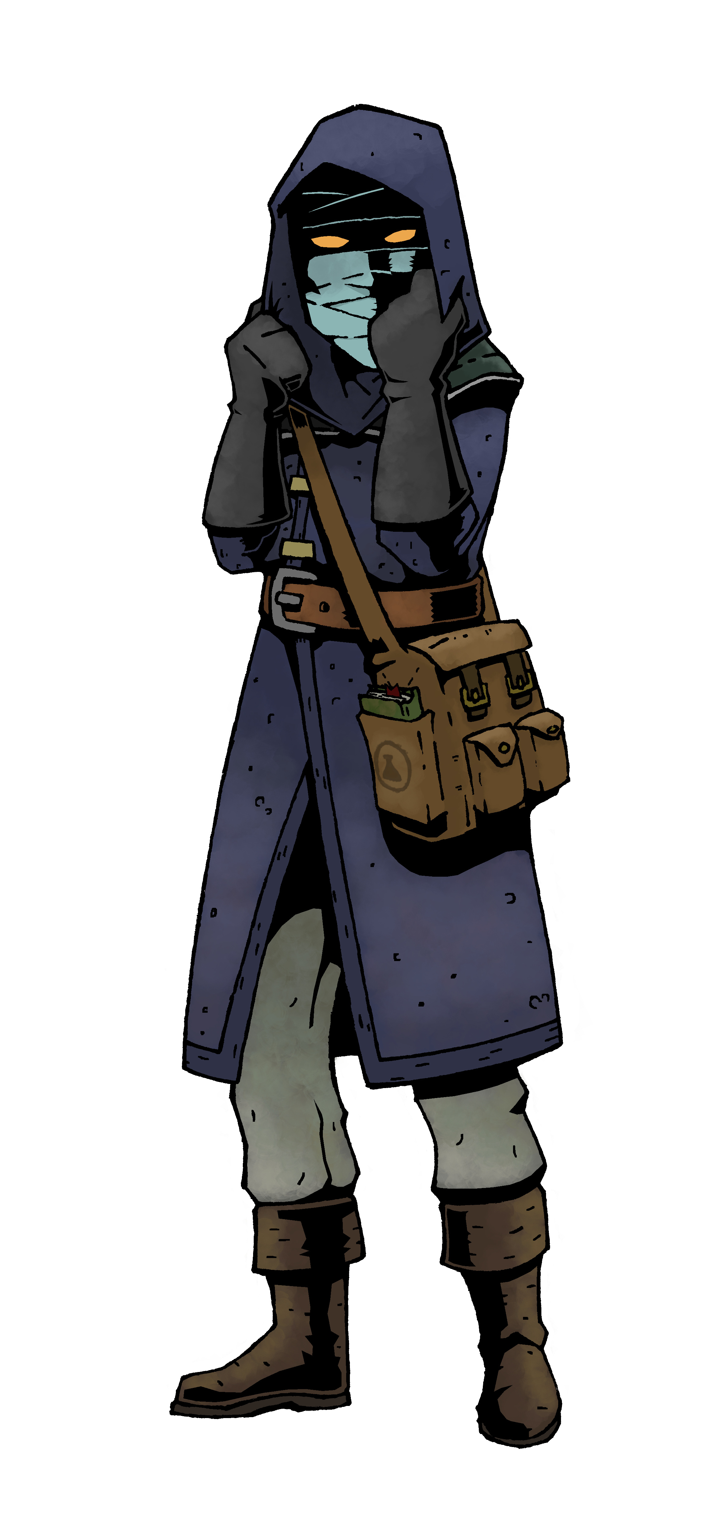
This is “Former Royal Alchemist, Professor Shadewell.”
*Edit: Couldn’t get the pic in here the first time. Operator error I’m sure.
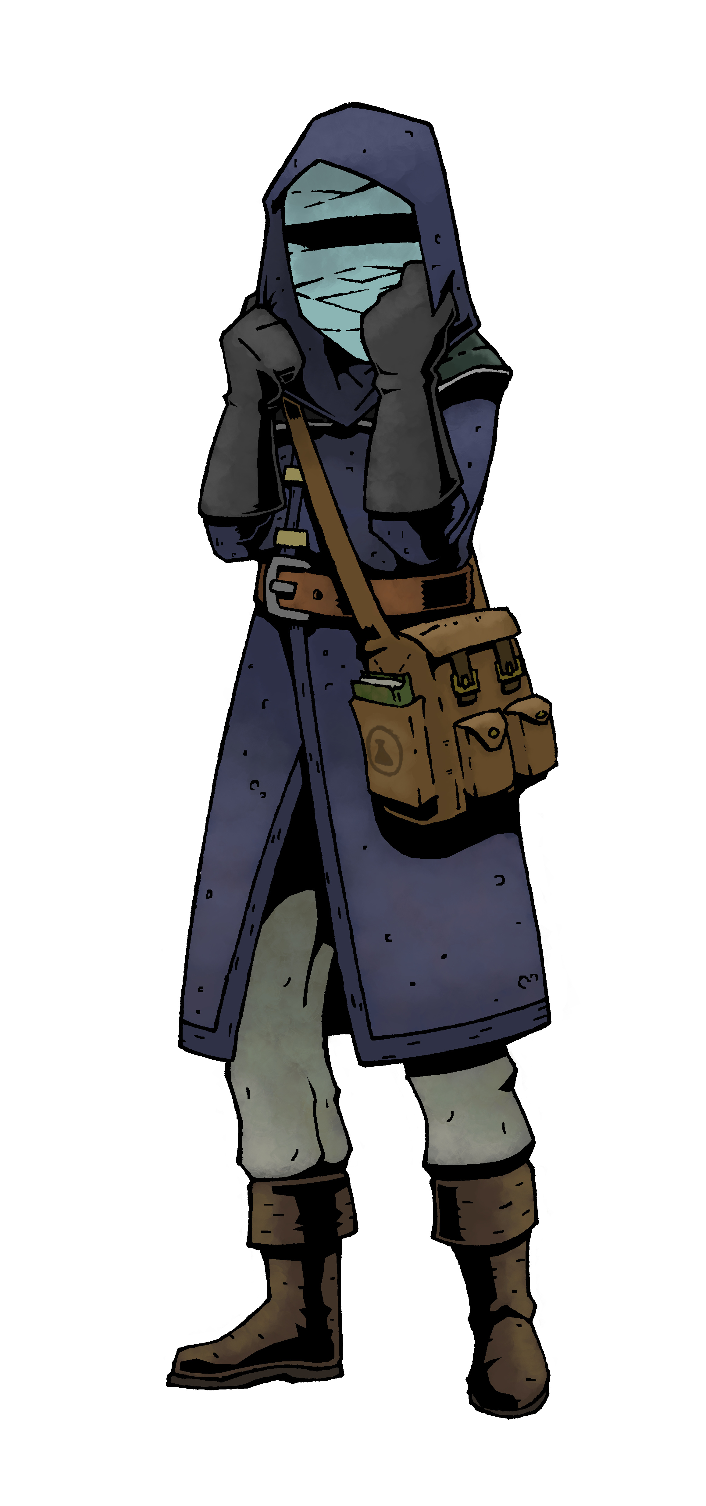
*Edit Edit: Final version up. Thanks for all the insight and help!
First Commission: C&C Please!
Chaologic
#1
ibogre
#3
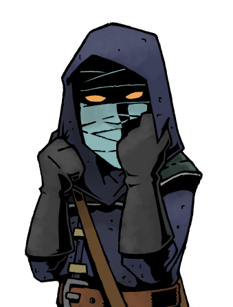
There is something missing with either the face area or the pose. The face and wraps look flat. Eyes or a more shadowy appearance or a slightly more dynamic pose would help the character really pop.
As for color and line work and all that, it looks great. The bag in particular caught my eye.
Just figure out what gives the character that last bit of dynamism and you will have a fantastic finished piece!
Hope that helps
Anthony_C
#4
The face is definitely a bit flat, and maybe a little too big, but this is an AMAZING job for your first time. It reminds me a lot of the Darkest Dungeon art, and I’m very fond of it. Great job. I would definitely accept this as character art.
Work on learning the structure of the face a little bit more so that you can bring that into your work so the face has as much depth as that bag. Keep it up!
Chaologic
#5
Thanks man!
He definitely wanted something inspired by Hellboy/Darkest Dungeon, thus the proportions off a little bit for the comic effect. I kind of feel the same about the face; his character is kind of a shadow thing and he said he keeps it wrapped like the invisible man. It’s been a bit of a challenge in some unexpected ways for a first one, haha.
Always improving, so thanks for helping me see some of this with fresh eyes. 
KaneDriscol
#7
Great work! Personally, the boots caught my eye because of how the shadows gave it some form and shape. Maybe try that kind of same varied shadows across the face?
Honesty I don’t think there is too much to critique here. If I was being nitpicky I would want to see a few more details. You might be restricted by the description you got. I love the book and symbol on the bag, but I would probably have a uniqu bookmark in the book and maybe something else peeking out of the bag. Details really sell a character. Again, that’s being nitpicky because I think it’s really strong overall.
Chaologic
#10
Ha! That’s a huge compliment, thanks a bunch. This is my first one, so I still have very little idea as to what I’m doing. I’d be happy to work with you on something though, we can figure it out together, lol. DM me anytime.
Geoffrey_Nelson
#11
a small cast shadow on the ground with some noise (rocks, broken sword, or other dungeon trash) can go a long way to making the drawing feel like it’s a character in a place rather than simply a concept floating in space. The eyes really help. (You’ll learn about what works and doesn’t but you’ll never really know “what you’re doing” if by that you mean you know how to avoid all pitfalls and begin a project with certainty. Blank canvas is blank canvas, and it will always be a little intimidating. Turn the fear into rocket fuel! knowing what your’e doing really just means you’re not afraid to make mistakes. Sounds like you’re already pretty close.)
ScottyRoberts
#13
Great job. Resize the face/head as it’s too large for the body and then take out the one line under the nose that makes it look like lips. You can do without it entirely. I like the suggestion of blacking out the eye area. Unless the characters eyes actually do light up in which case… leave them. The customer may well have asked for them? Also… on my left… the blue/purple of the hood goes behind their face. Change that. Black it in further. Its pushing the face too far forward and making it look odd. Another way to push the face back into the hood further is just under the hand on the right… you see the hood under and behind the chin. Change that. Add a line and color it in so it cuts off part of the chin. This will push the face back into the hood and create more mystery. Right now… face is too large and jutting fwd. These changes will fix all that.
Otherwise, great work.