Blood and Gold: Early Rev PDF and Playtest

hack

#1


Hi Shields!

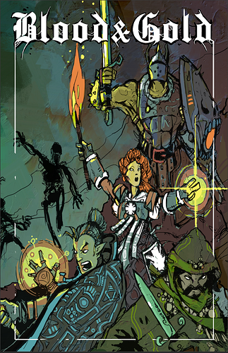
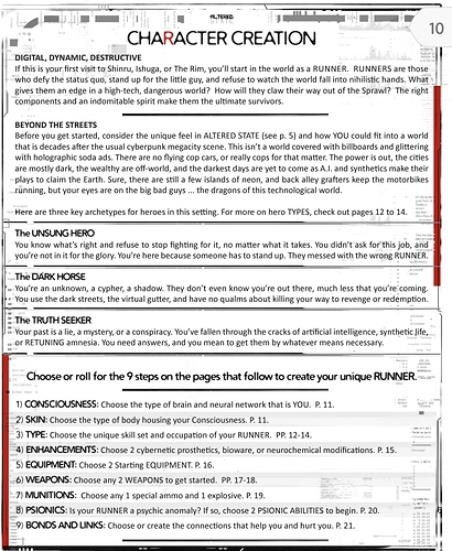
You might have seen Hank working on this piece on the old YouTube!! Here is a screenshot of the pdf with the cover art added, and I’ve uploaded the wip pdf to the google drive folder listed below. Thanks again for looking!

Over the last couple of years I’ve been hacking, and putting together different ‘Frankenstein’ systems with mechanics and rules from some of my favorite games.

Well, I’ve finally gone all in on my ‘Heartbreaker’ game: Blood and Gold.

I’m sharing the drive link to my early Revision pdf of the game with this post. Feel free to take a look and if you so desire, provide some feedback. It has a ways to go yet, but it’s at a spot where I feel like I can share it with you all and open myself up to some criticism.

This is my first foray into using something other than google docs to put together a pdf. I pulled the trigger on Affinity Publisher for windows, and I’m learning that as I go. I also have procreate on my IPad that I used to make the border for the pages.

The other reason for this post is that I am play testing these rules with my home group on Thursday evenings… but I need more play testers for true feedback. So, I invite anyone and everyone to play test these rules, and let me know what you think! I also would like to form another semi regular group, for 2 sessions monthly, depending on availability. I can be flexible on the specific time, day, or evening, as I really want to publish this eventually, and need to be serious about it.

I appreciate you all, especially if you made it this far! Feel free to reach out via this post or hit me up on Discord @nrod0784(king_w00k)#9980

Play test discord: https://discord.gg/TyGNHXjcRM

Edit: Ok. Thanks to all who provided feedback! I’m pulling the google drive link down at this point. If you’ve looked at the game or downloaded it from the drive for free, and you feel like being generous, hit the druvethru or itch link up and drop me a couple bucks! If you can’t, or don’t feel it’s worth it, no worries!

Lastly, if you come across this post in the significant future and are interested but cannot afford to shell out the 2 bones for the pdf, dm me and I’ll set you up!

I should get my proofs in a couple days and then I’llpinh this thread once the printed version is available.

Thanks again!


#2

That’s a ton of work and seems like a fun little game. My early feedback from a document design perspective is that the font choice is brutal on the eyes. It’s one thing if the headers are kind of fancy, but from a human factors standpoint, you kind of want the main body text to be easy to scan/read. After that, the doc just generally needs some horizontal elements to help break up the pages/spacing adjustments.


#3

Thanks for the feedback Alex!

I’m new to layout and design of this nature. When you say horizontal elements, do you have some examples? I’ll look into some other fonts, that was a thought I had as well, while I like the font I chose, it does seem to drag my eyes a bit when reading through the pages.

Thanks again!


#4

Hey @NRod, sure thing. Here is a page with a bunch of them:

Overall, great work, though.


#5

Ok. Changed the fonts up to much more readable fonts per Alex’s suggestion, with some bolding added in certain areas as well. Minor rules tweaks (mostly just restatements of the same that makes more sense to me after re-reading it again).

I will go in tomorrow and try and add some horizontal elements as Alex suggested.

If you have any criticisms, good or bad, please send them my way!

Thanks!


#6

Ok, didn’t really see anyway to add horizontal lines to break up the pages a bit, but I did add some black boxes around white text for bulleted parts of the rules in Rev 0.6, and I think it does the same job. I have both rev0.5 and rev0.6 in the drive, so if you feel like helping a shield out, take a quick look at both, and let me know which is your preference, and why! Thanks!


#7

Looking really good. It’s starting to have a really strong professional feel.


#8

Thanks Alex! I appreciate the support here and on the discord.


#9

That might be on me, but my glasses are on my face and I feel the fonts are SO small to read. It might also be the black/white backgrounds toasting my vision there. It’s a brutal shift from one to another.


#10

I will second the white text on black. You have to be careful with that. It is very hard on the eyes, because they have to open wider to absorb more light. The eye fatigue there is way high.


#11

Actually, let me also offer a solution instead of just focusing on the problem. Going the other way, the easiest setup on the eyes is a light background with darker text. So, light gray, tan, or blue backgrounds with a darker text. One fix might be to make those text boxes you have gray and then stick with darker letters. This way, you still retain the visual design of setting off those elements while making them easy to read for your reader.


#12

Yeah, I was noticing that when reading through it. While looking at it was visually appealing to me, actually reading through was difficult.

I just got done transmitting updated text in Affinity back into Docs, as I’m total noob with this software, and didn’t realize that I made a big mistake up front by not setting up Master Pages correctly, and using Text overflow with some rules. So, I’m going to recreate the Affinity file in a new file, and play with layout there.

Thanks for the critiques @Alex @Nicolas_Bohnenberger!


#13

Ok, I think it’s almost there. I redid the layout completely, single column now, and I think it’s MUCH better. Added some horizontal grey lines as well per Alex. I think the background needs to be tuned down just a bit on the opacity, but I’ll do that tomorrow. If anyone has any input, I’m still all ears!


#14

I’d say to lighten the grey backgrounds a bit more. They’re much better than the back backgrounds, though.

Any particular reason you dropped the 2 column layout?


#15

Thanks for the advice!

I’ll do that next, I lightened up the background image and it made a world of difference already.

For the two column layout going bye bye, it was due to the font size. Increasing the font size to make it more legible made the format look off to me, and increased the page count as well. And I had to redo my whole Affinity file because I didn’t start with Master Pages correctly, and I also didn’t know about the auto flow of text functionality. So I redid my text, and let it flow. Also, with a single column, I was able to add in some more divider lines as Alex had suggested, and I really like the way they look. So, in short, bigger font, easier editing, and I actually like the way it looks better this way myself. @Nicolas_Bohnenberger


#16

Killer! I asked because it felt like a drastic change, but it’s looking real good!


#17

Ok. I’m done for today haha. I uploaded rev 0.9 with some minor text updates, and some layout changes. Lightened up the grey boxes and made them semi-transparent, and it looks great to my eyes. Added Chapter Headings and a Table of Contents, and pages for a future glossary, example of play, and indices. Next big thing I’m going to tackle is the monster section, followed by expanding the adventuring section. After that, I’ve decided to do a Magic Item section as well with some Magic Gear Tables. Last up will be a GM advice section, a Rules Summary page, Character Sheet and endpapers. Guessing at this rate it will be close to 100 pages, possibly more when I’m done with it haha.

But for now I’m turning my brain off.

@Alex @Nicolas_Bohnenberger. If you two gents could take a gander when you have a free moment and lend some more feedback, I’d greatly appreciate it!


#18

Looking much nicer! Only change I’d make is with the spacing of the grey boxes - they’re very close to the regular text, makes it feel crowded a bit.


#19

Big overhaul on the magic system. New system derived from Sharp Swords and Sinister Spells with some new ones added in and split divine and arcane lists. Removed the grey boxes on the text in favor of bolded text instead. I like this look better.

Please let me know if you have any thoughts! Thanks shields!


#20

Streamlined the system a bit overall. Added 65 monsters in the monster session. Take a look!

I will be releasing this during itch.io gamejam in June for OSR/ASR game month and drivethru as a beta. So any and all feedback is greatly appreciated!