Agoth-Agog


#1

One of the things that made all of Runehammer’s work stand out was the graphics. It was so different than anything out there.

Now of course there are others that seem to fit in that “family”.

I’ve got a couple of on-going, and going, and going…campaign settings I’m working in.

But what I want to know is would this catch your eye, and then would seem congruous with the ICRPG vibe…Would you notice?

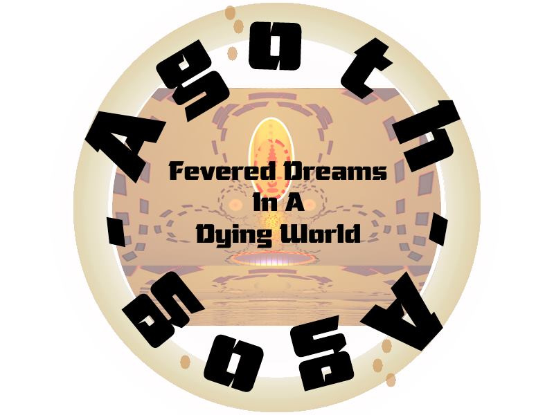
Here’s another idea for a cover graphic, does this fit better? Does it at least catch the eye more?

Once i have my head wrapped around it more I’ll post a concept of the cover.

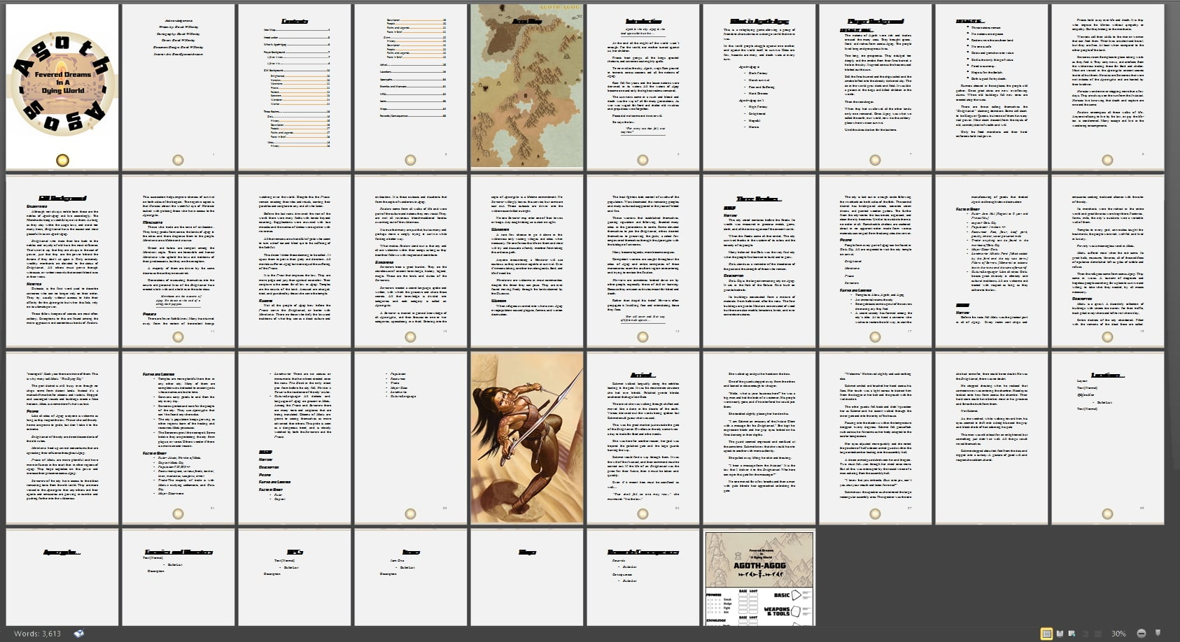
Here’s a follow screen capture of where the layout is so far.

I’d like to partner with anyone interested in rules adaptation and play testing.


#2

Taking a look at the picture you posted, are you talking directly about the layout you’re building or the tan, almost aged map vibe in the close-up shots?


#3

I’m thinking overall design.

I know its hard to get a feel for the document since it is just a template, would the colors, map style, and font work? If your scrolling through a page and see it, would you stop and take a look?

Thanks


#4

Hmm… It’s really hard to say. I don’t want to be too critical because this is a work in progress, but initially, I would say no. It wouldn’t catch my eye if I was scrolling through a page.

Hankerin did some really good live streams on the subjects of Publishing and Layouts that really changed how I think through my projects.

Writing to Publish

Layout and Page Building

The key takeaway that I have thought about over and over since watching those is that everything should highlight and build up your theme. The graphics, the text, the layout should all support your overall theme and help convey immediately what you want the readers to know about your project.

Based on your image, I’m not entirely sure what your project is about, what the theme is, or what my experience might be when I play it. I understand Dying World, which is intriguing but what makes it pop, you know?


#5

Thanks for the input.

I keep at it.

Agoth-Agog is something that hit me this morning. I put a couple of hours into the basic graphics style and layout.

The following Campaign tags come to mind…

Planet decimated by climate change

Only one continent remains

Population control

Nautical technology long abandoned [Nowhere to go]

The future is under the waves

Take what you can’t make

Survival without hope…

Anyway, just a seed, I’ll see if it grows.


#6

It’s really difficult to judge layout when the elements are separated. Any chance that we could see a full page instead?

Also, regarding theme, Hankerin uses the example of “Skull”. Which is ok, but perhaps a bit limiting. The theme can be a thing or a concept, but it can also be a mood, genre, or similar. So you could also have a “space cartoon” theme, or whatever, if the setting is hard to pin down in a single idea.


#7

Thanks for the reply. I’m more of a writer first sort and I’m typin’ away right now. As the idea ferments I’ll update. I appreciate the help.


#8

I like the central graphic in the badge. Good you included the hints of purple.


#9

Thanks. It’s coming along.